GENERAL
Who Has The Best Graphics; Apple Or Google?
Apple and Google are both tech giants who take pride in UX and design but why are the products created by one so different from the other (besides the times when they actually copied from each other)? While I don’t work for either company, as a hybrid Apple and Google user who happens to be in the design industry, I decided to illustrate the different design approaches observed between Google and Apple.

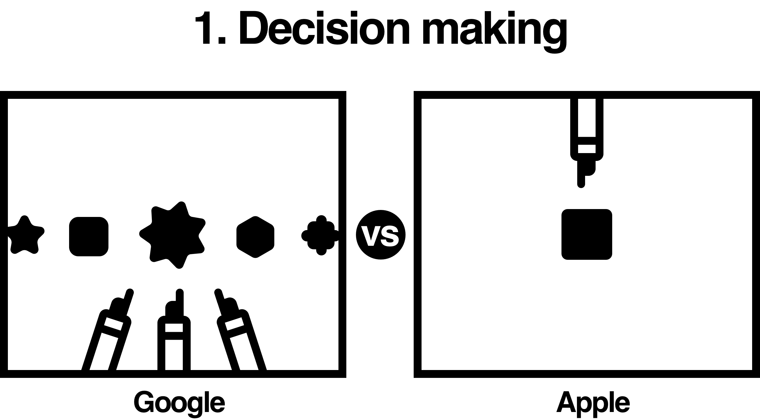
Google: create what users think they want
Apple: create what they think users want

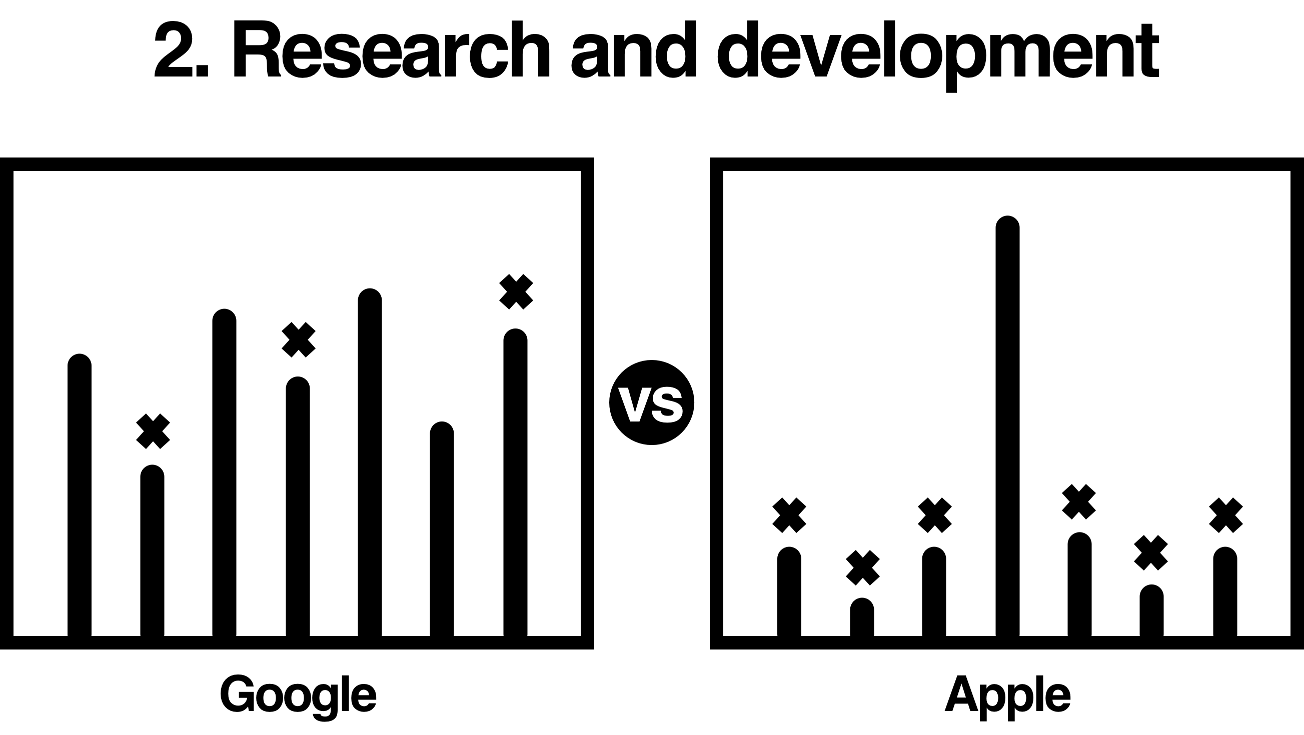
Google: development over research
Apple: research over development

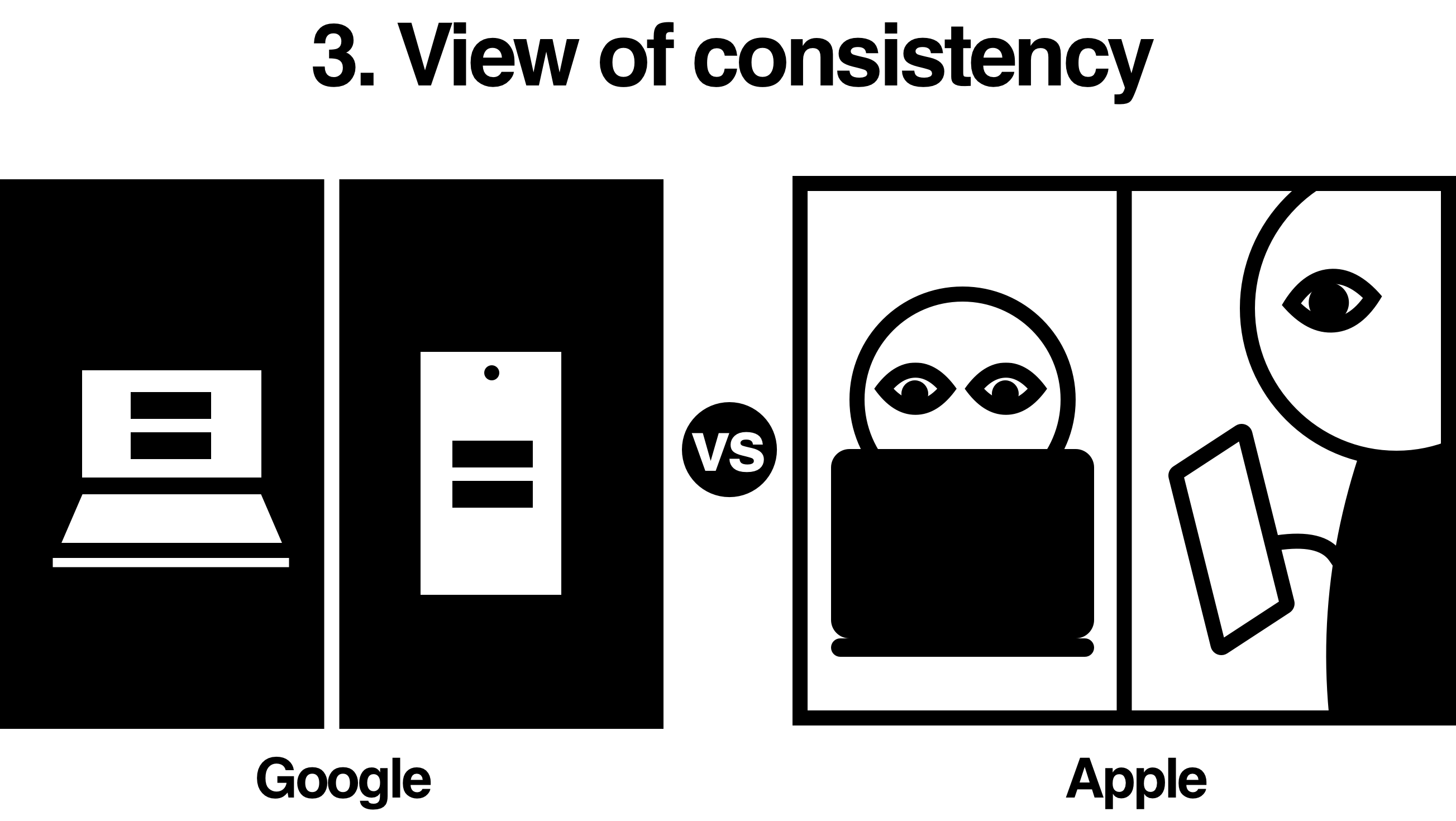
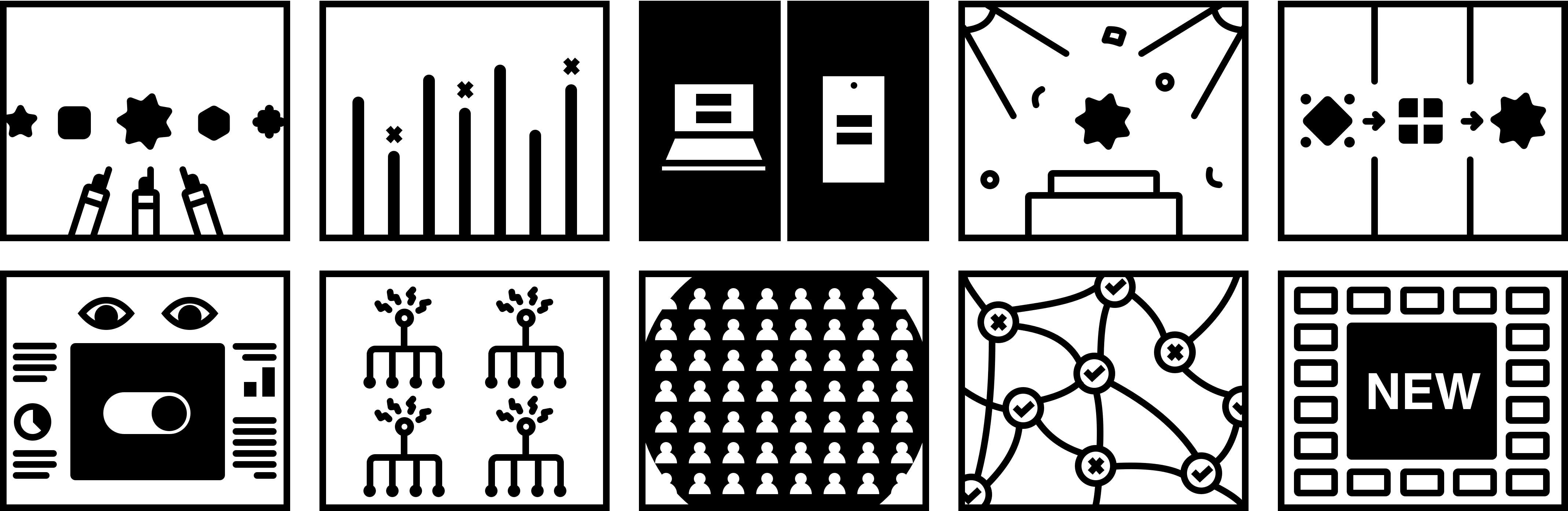
Google: consistency focused on visual consistency
Apple: consistency focused on user experience

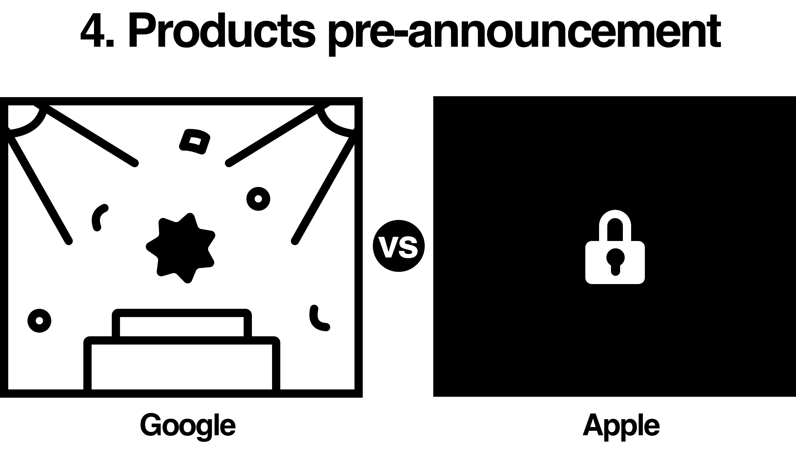
Google: press releases and teasers
Apple: none

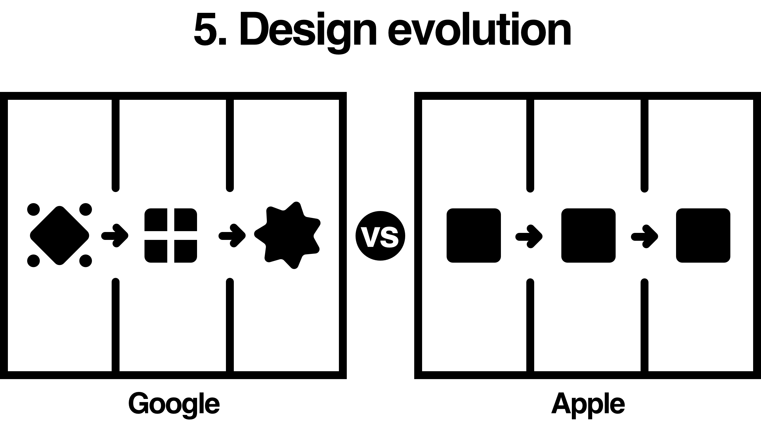
Google: redesigns and new trends
Apple: evergreen, long-lasting design

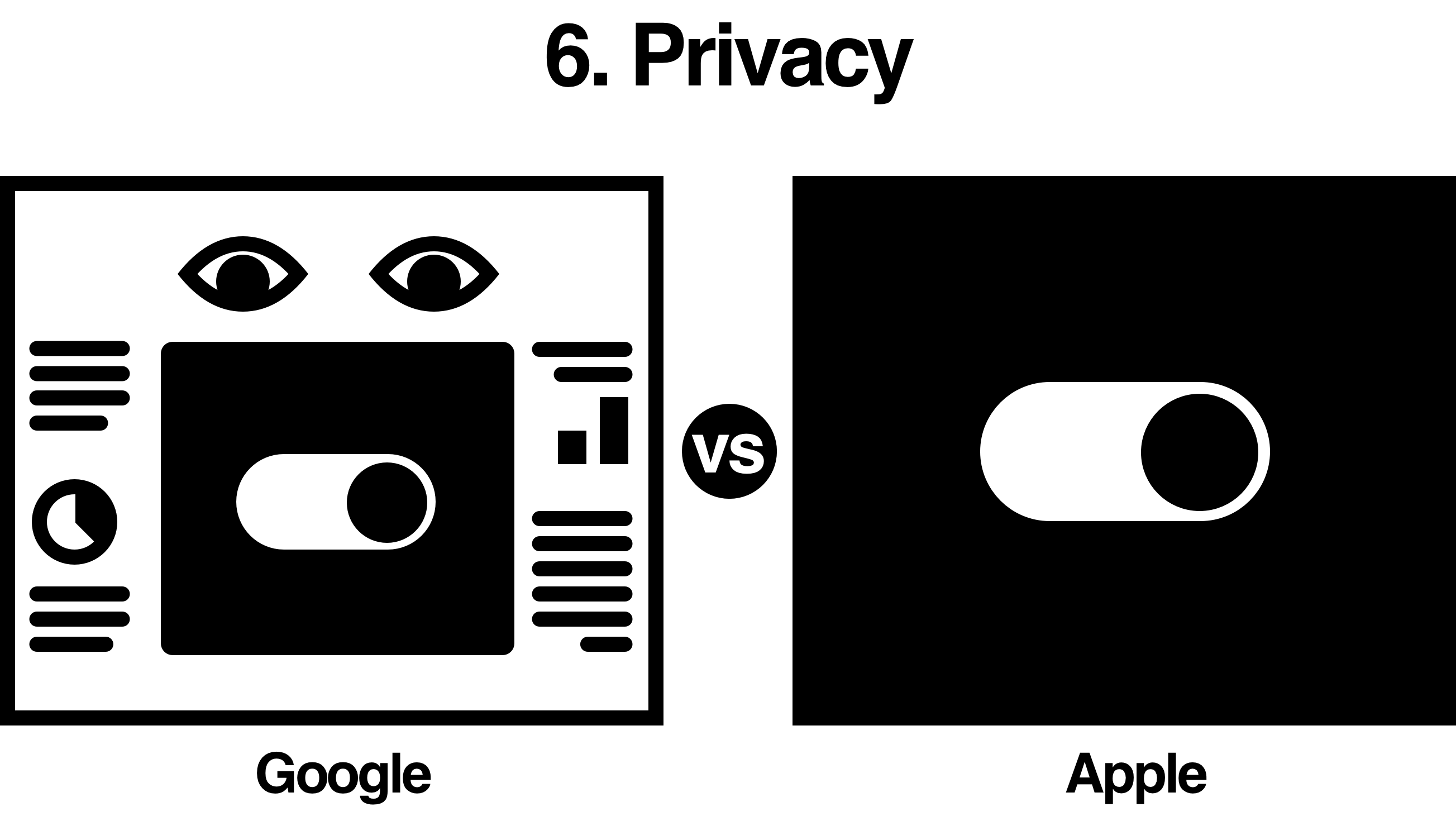
Google: simulated privacy
Apple: true privacy

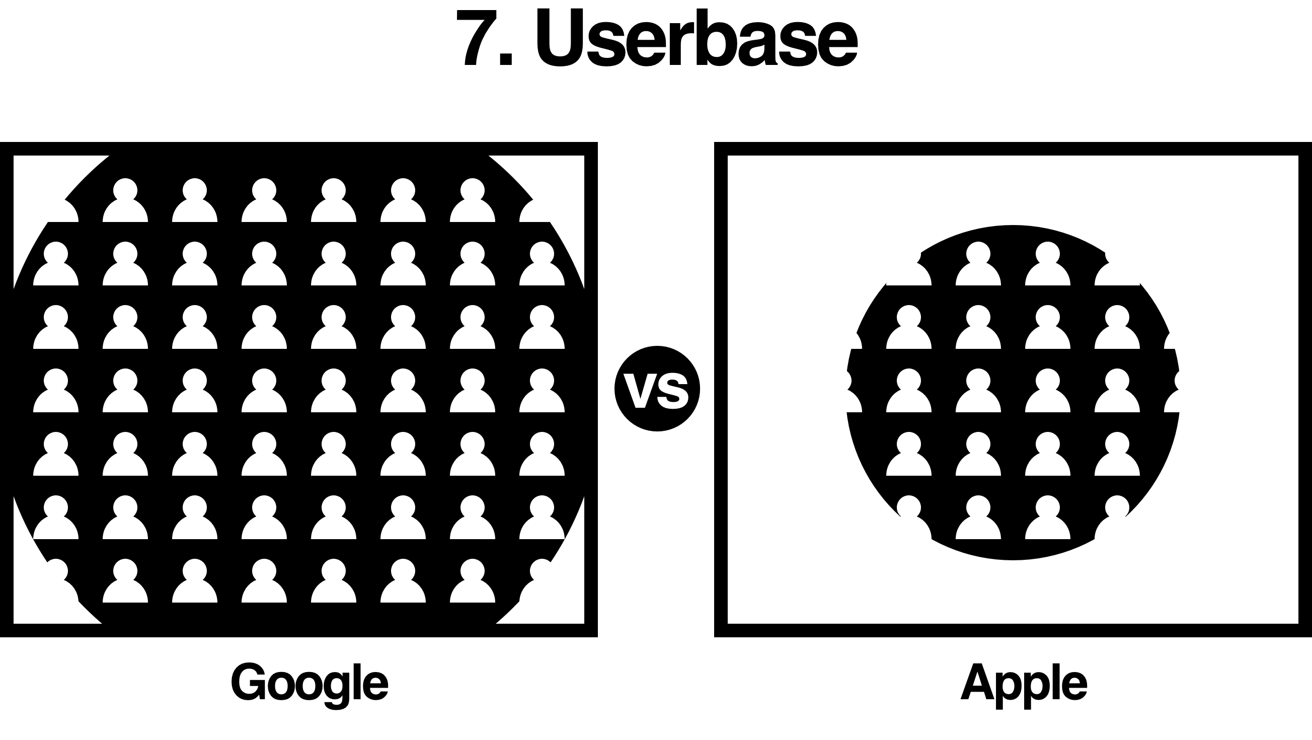
Google: extensive coverage
Apple: limited coverage

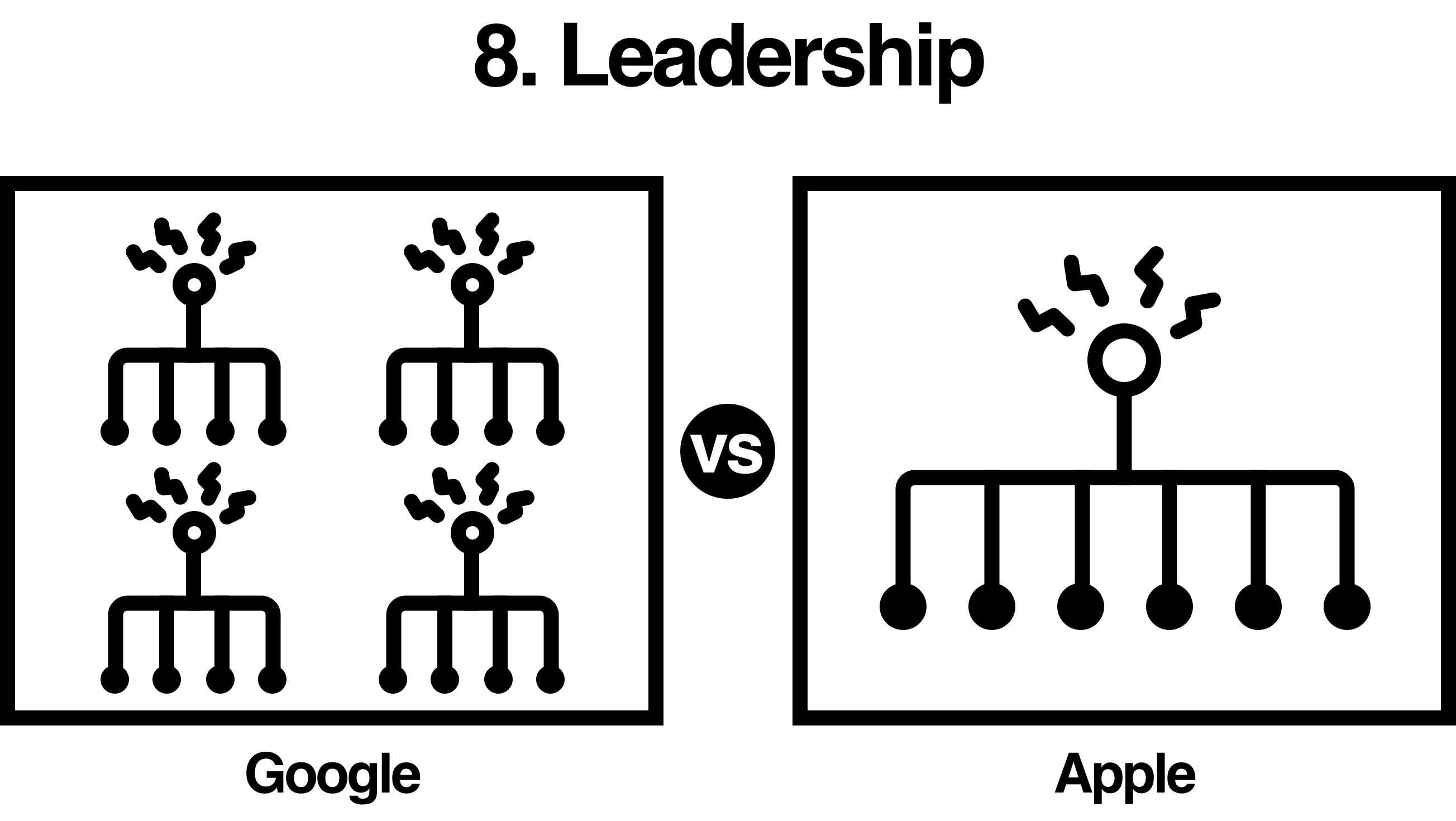
Google: flat structure with distributed power
Apple: hierarchical structure with centralized power

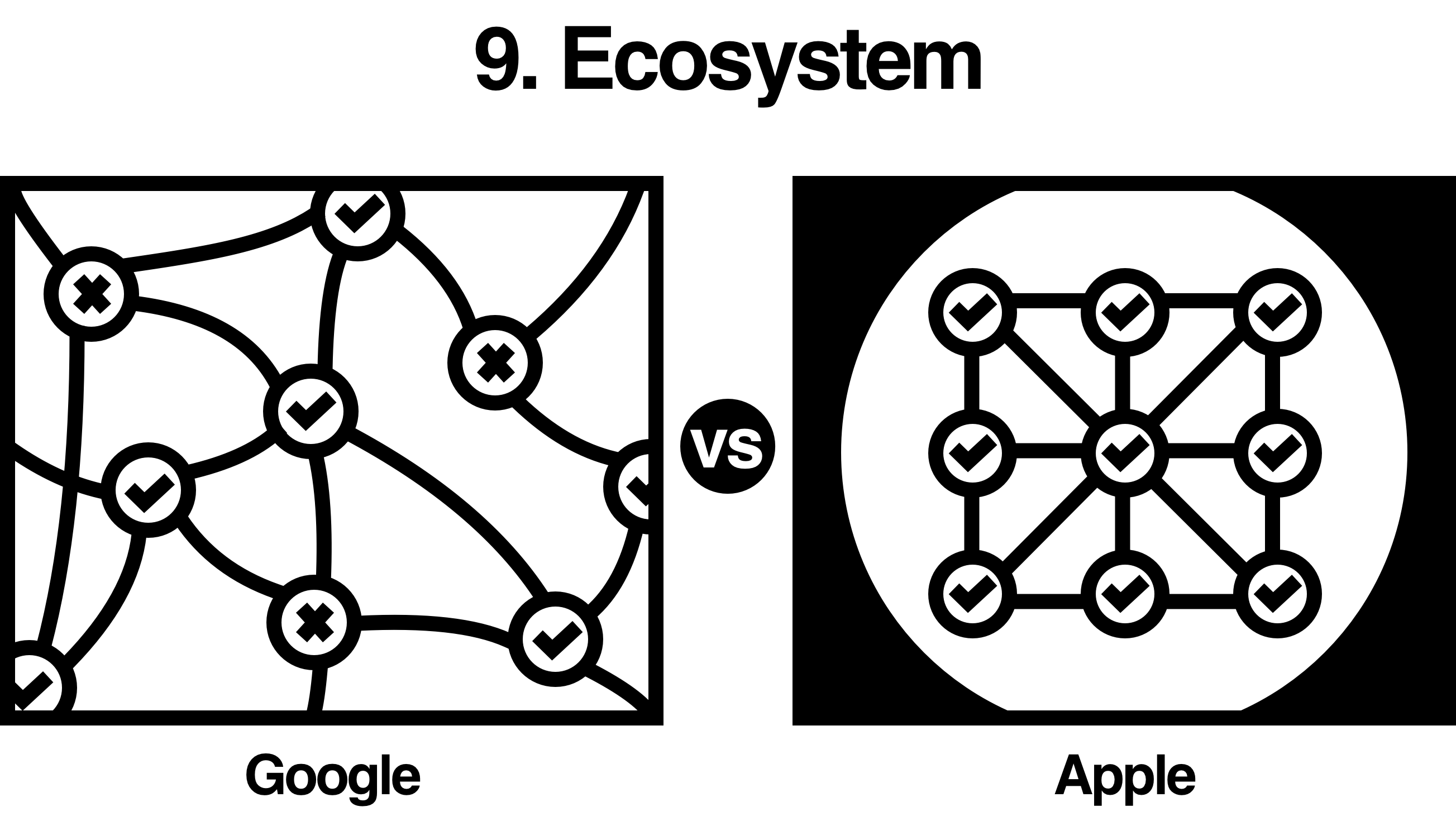
Google: open-source
Apple: proprietary

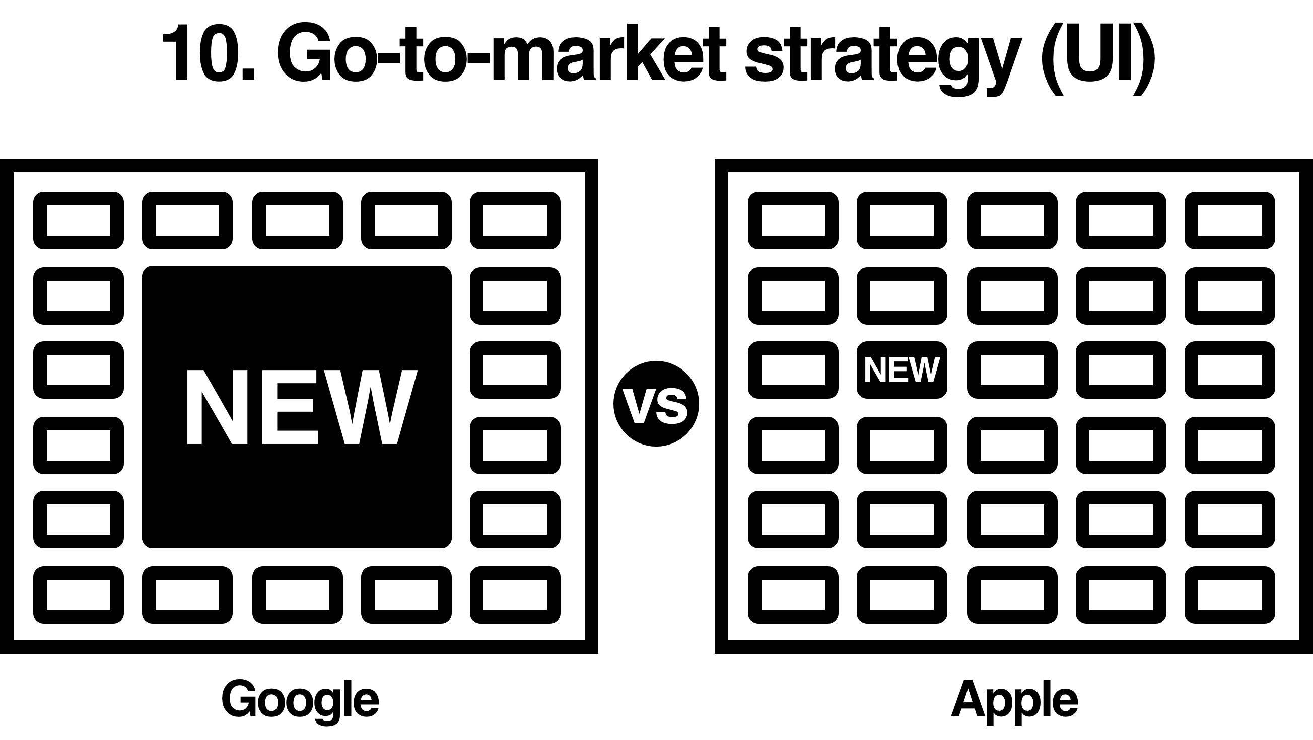
Google: spotlight and promotions
Apple: retain existing structure
Apple in a nutshell

When the first iPhone came out and a reporter complained about how it was too hard to type on a touchscreen, Steve Jobs replied: “Your thumbs will learn”.
That’s Apple.
Apple often knows the users more than the users know themselves. They do this by lengthy and careful research and focusing on providing good and consistent UX and evergreen solutions. They also have a hierarchical structure where a few elite designers control the quality of the final deliverables. While it is great for crafting perfect products, it often requires more time and effort upfront. This “we know what you want” approach can also sometimes be seen as less friendly to many which limit its userbase and could offend users in the niche market who, for example, look for a physical keyboard on phones.
Google in a nutshell

Google, on the other hand, tends to get validation from its users. They often open-source their work when possible and appreciate contribution and feedback from the communities. This helps them create a diverse product portfolio efficiently and bring in a massive userbase (where Google collects its data from). Just think about all the things an Android phone can do that an iPhone can’t. However, users don’t always know what they want. Remember the modular phone Kickstarter concept that went viral in 2013 and then got took over by Google? It was a beautiful concept but it failed. Heavily relying on users has its pros, and certainly its cons.
While users’ voices should be heard, designing for users doesn’t mean making them the designers. It means to observe the users to learn what they want. Though Google tends to be used to agile development and can make quick adjustments when mistakes are made.